Image scaling
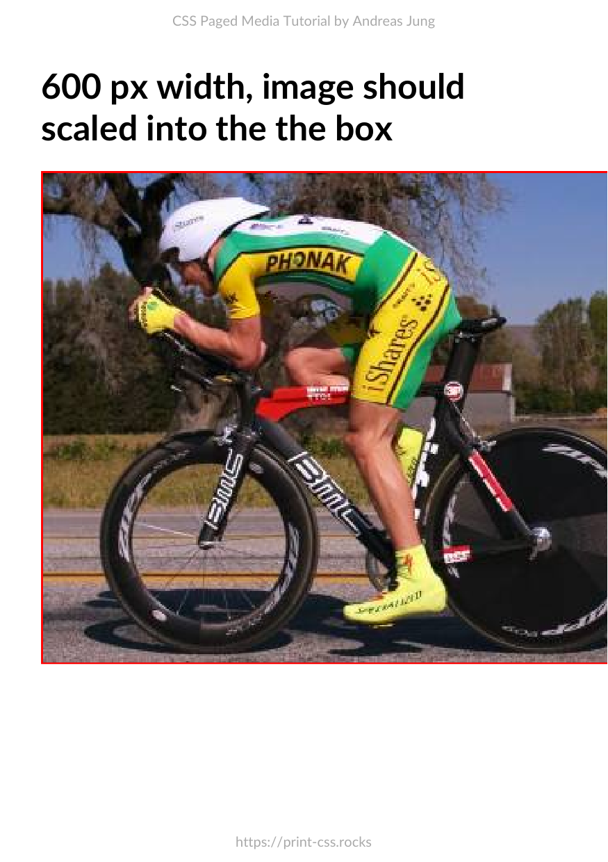
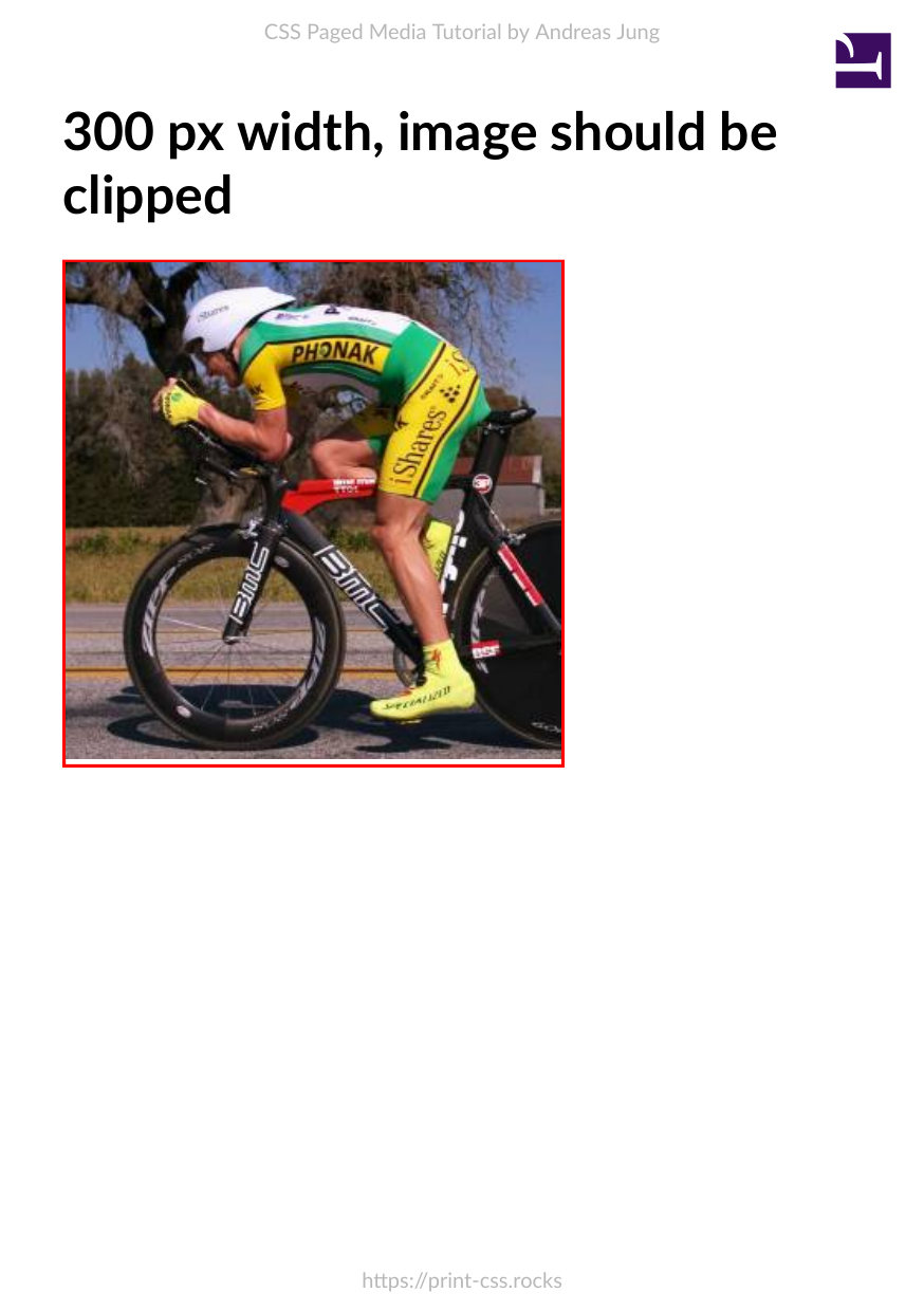
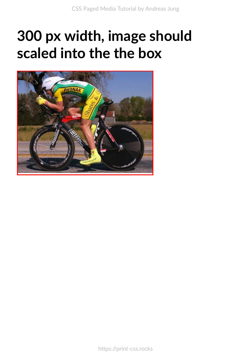
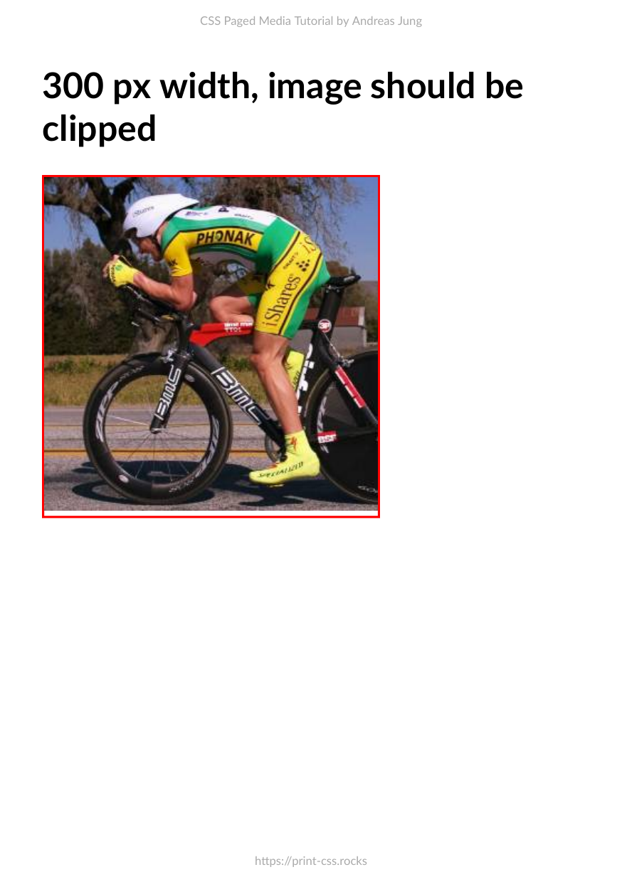
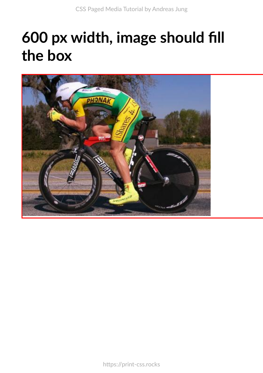
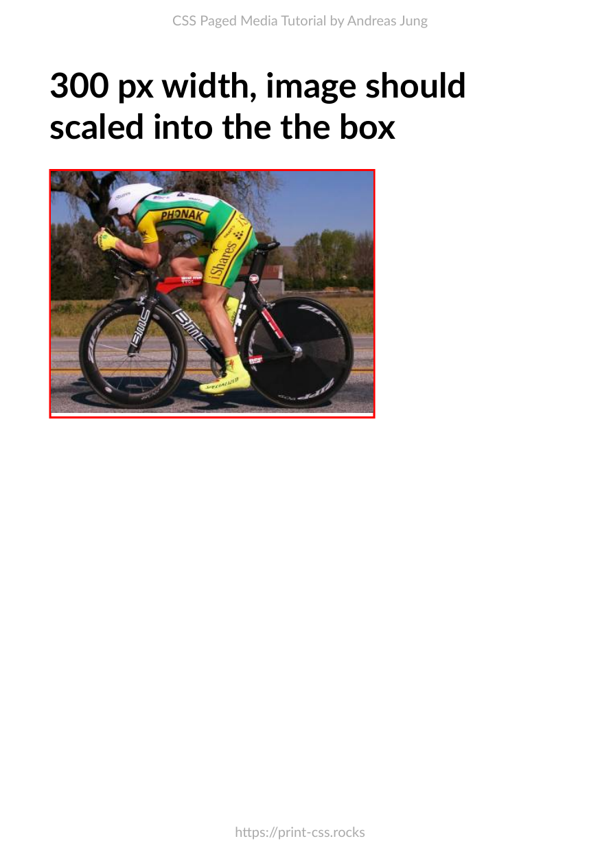
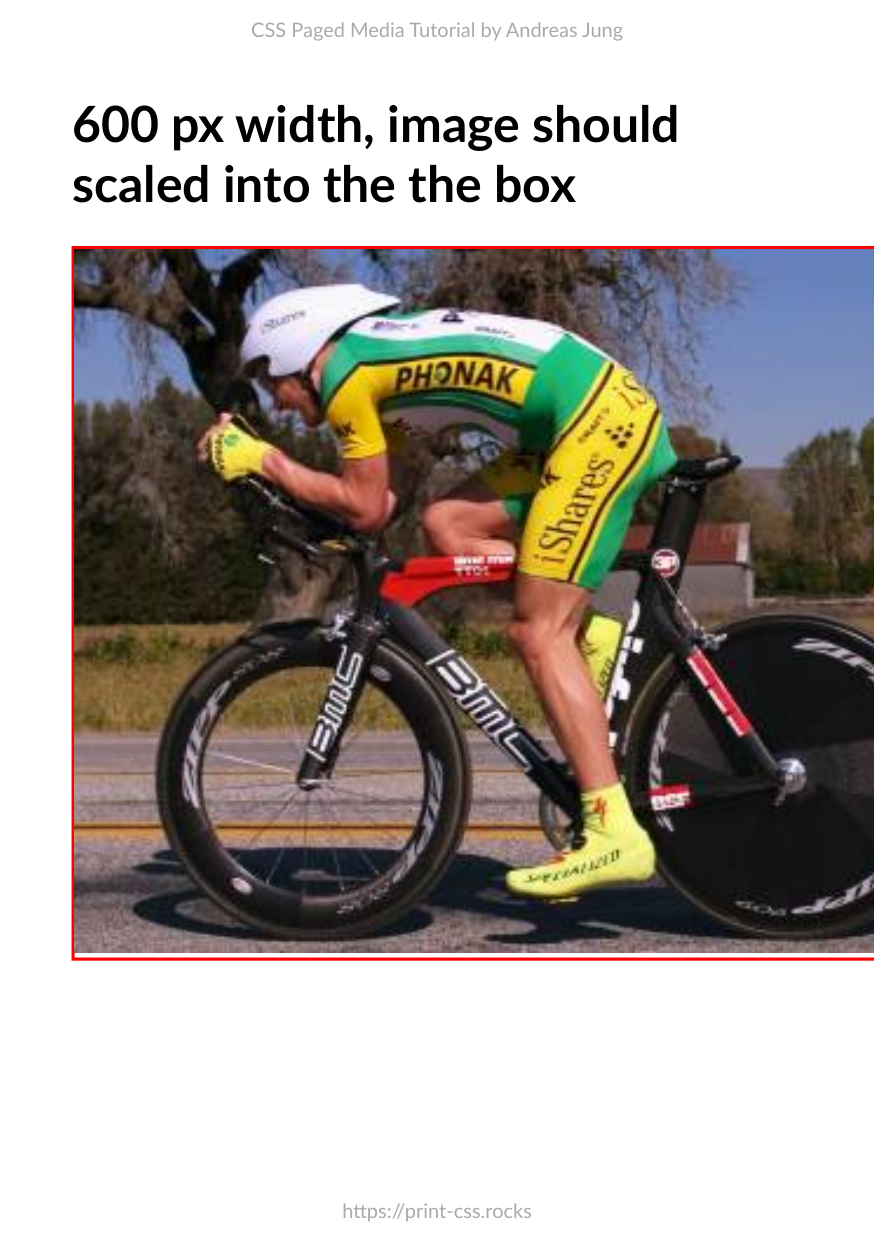
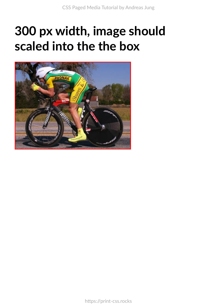
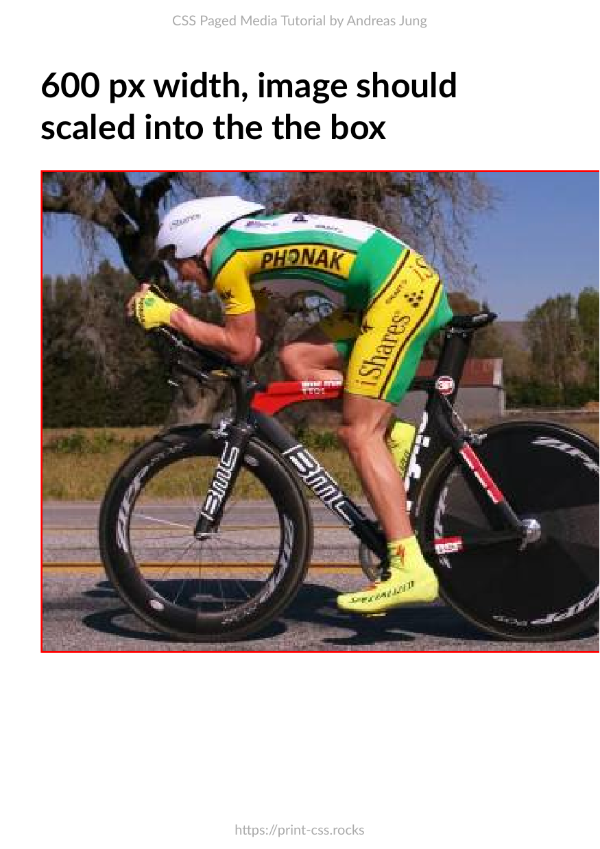
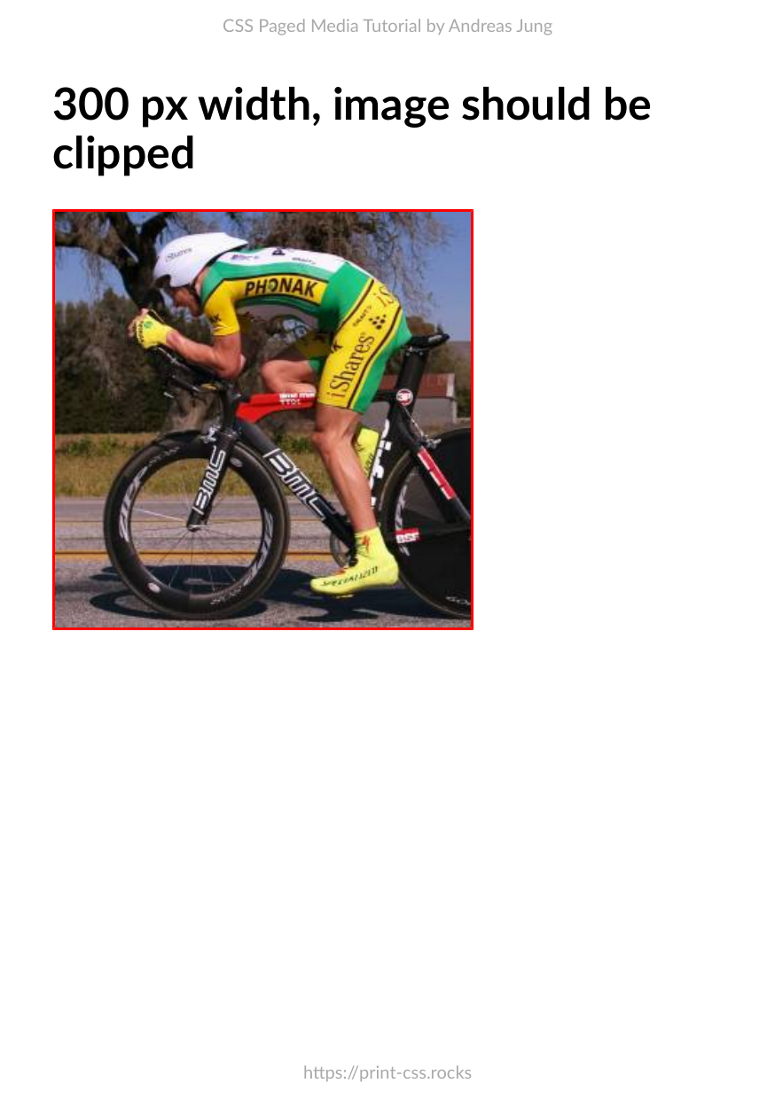
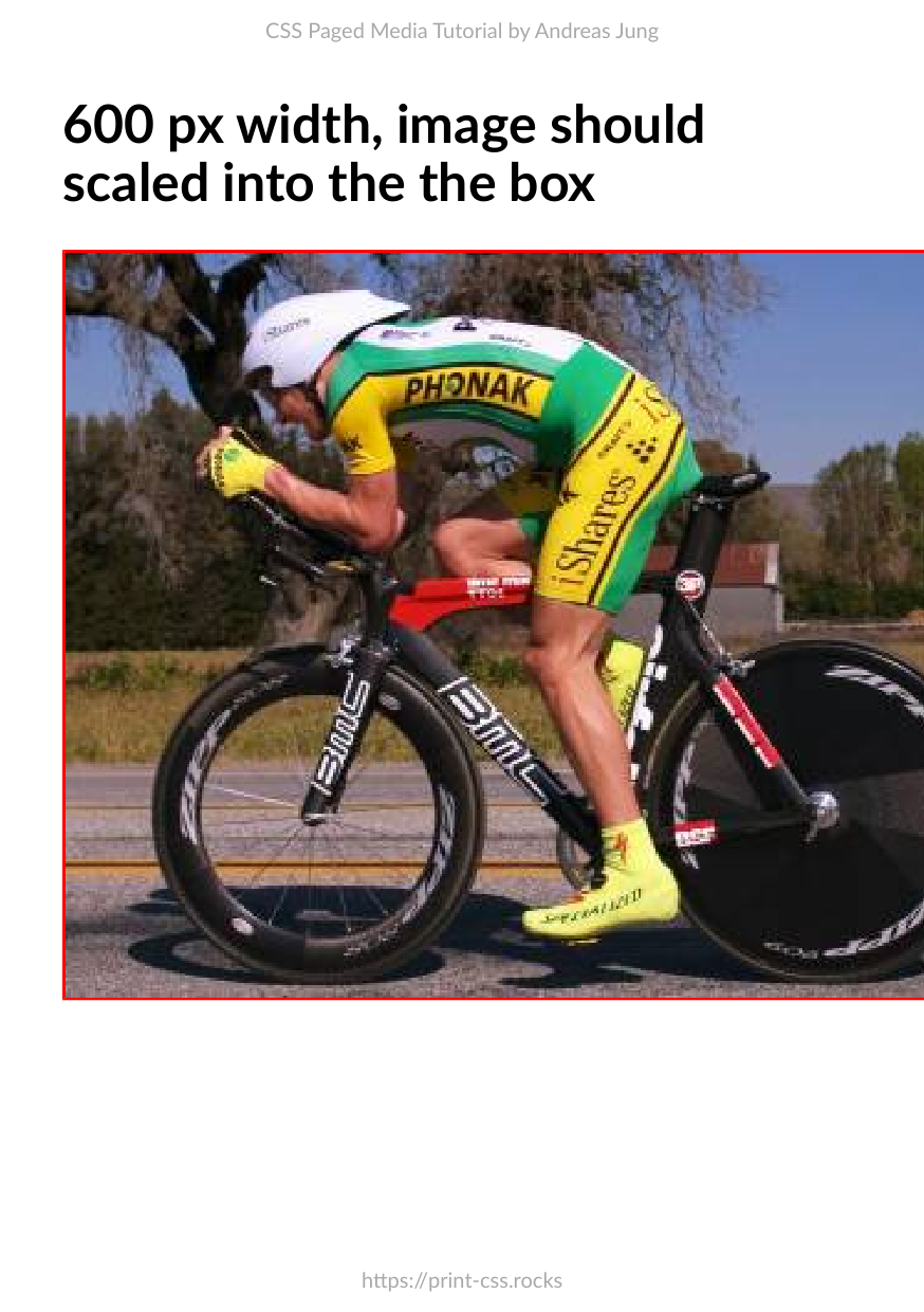
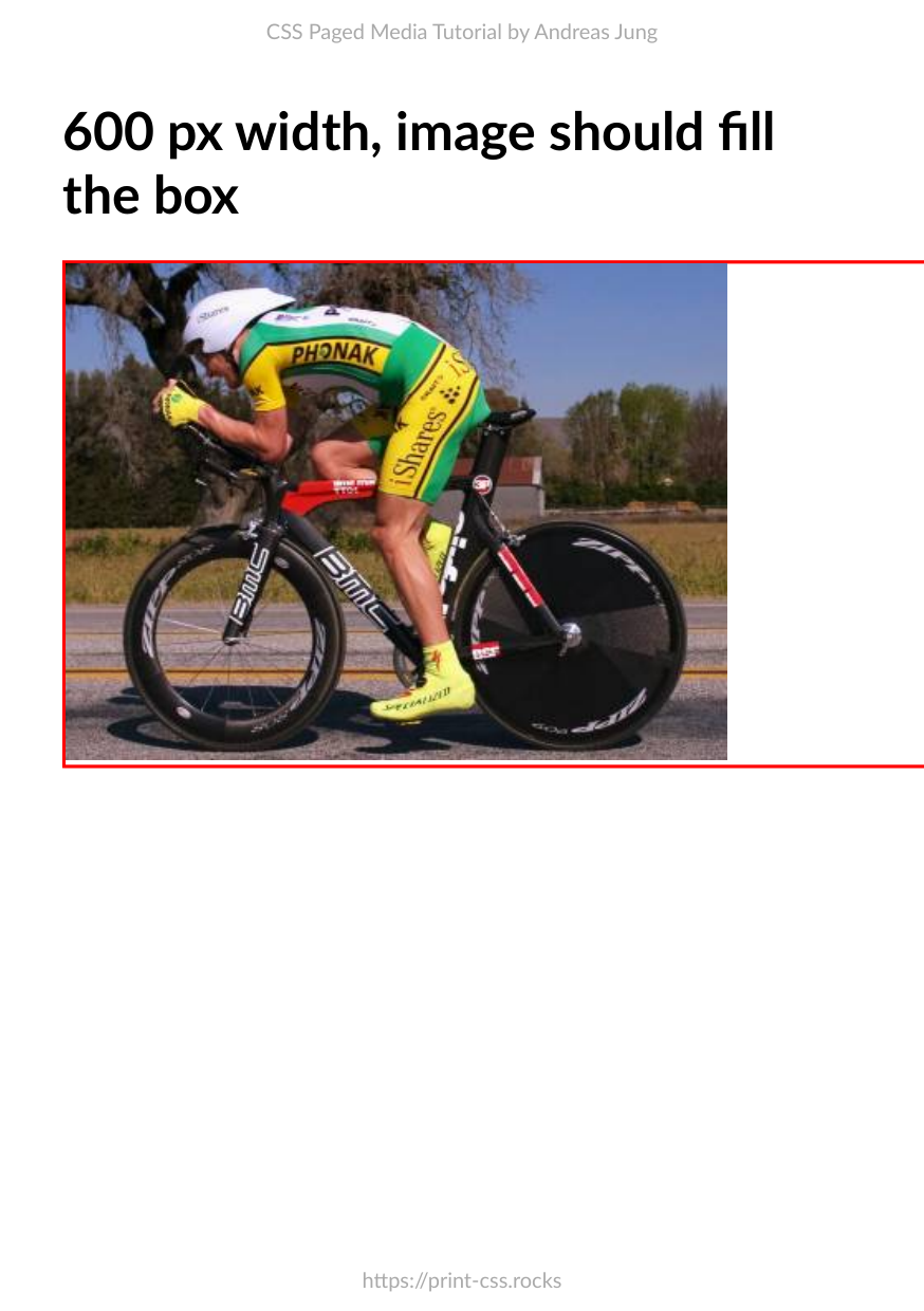
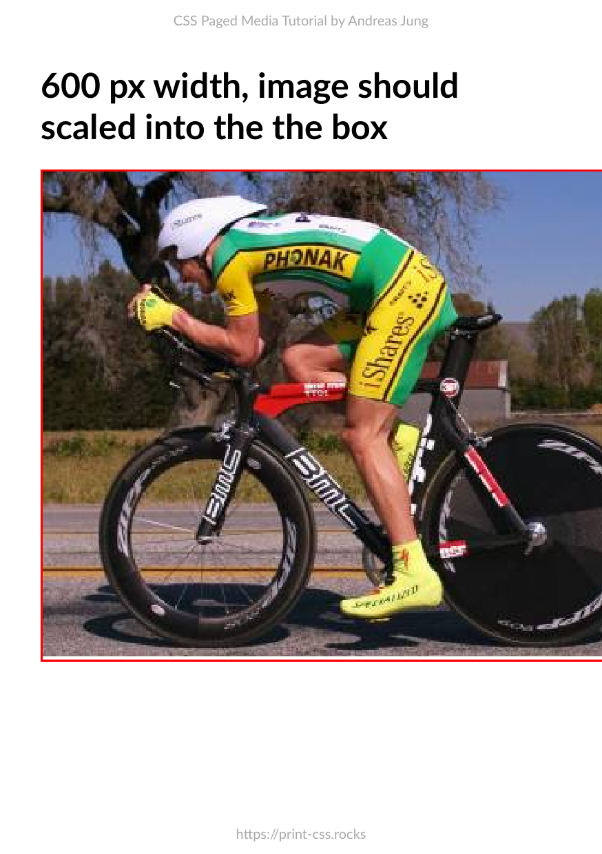
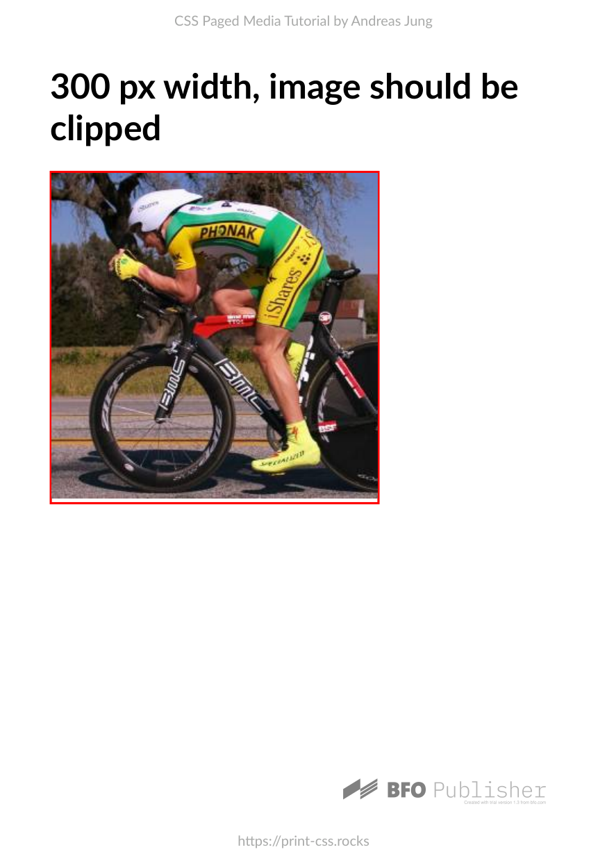
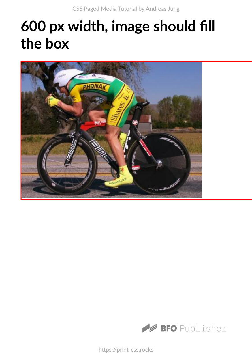
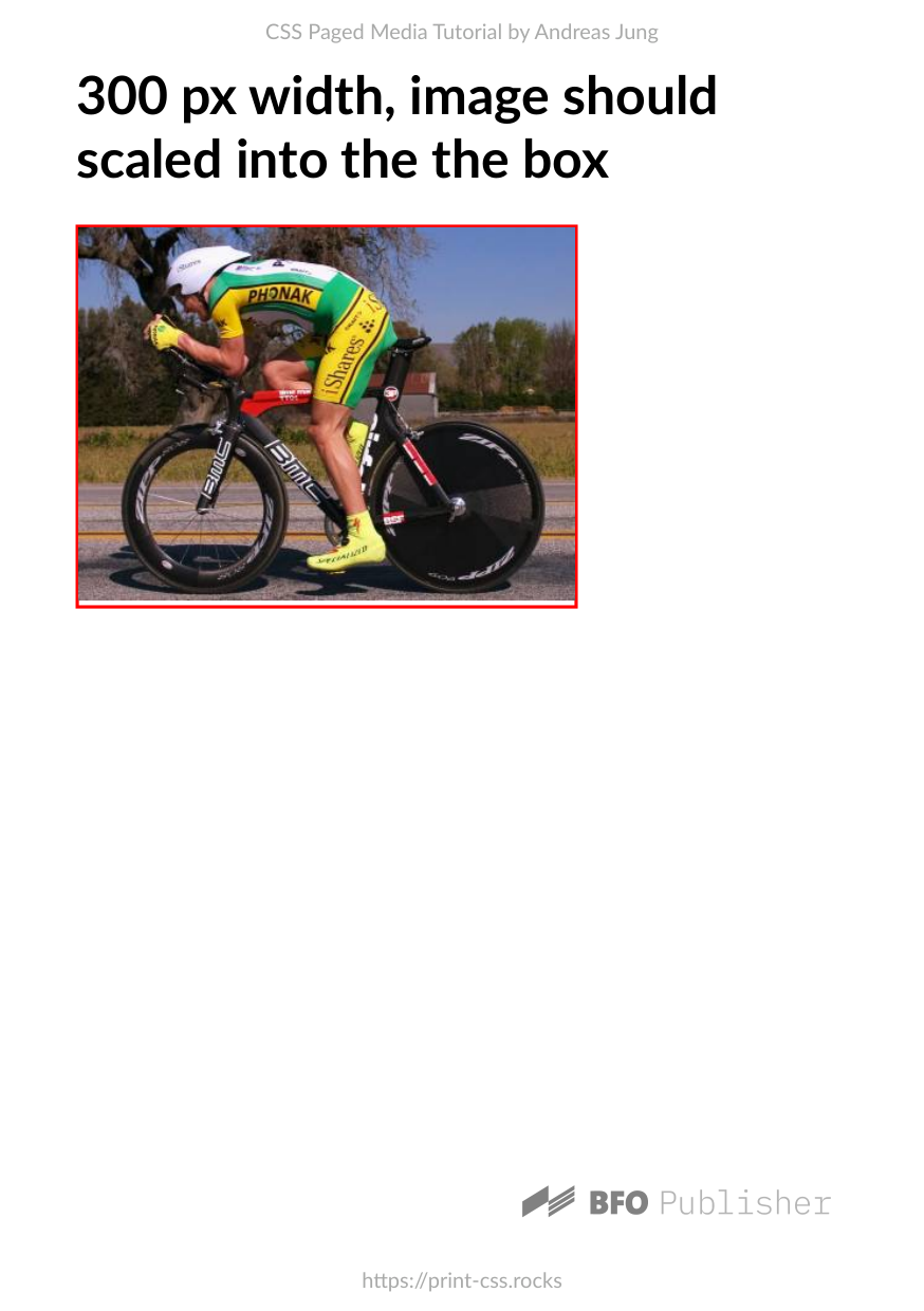
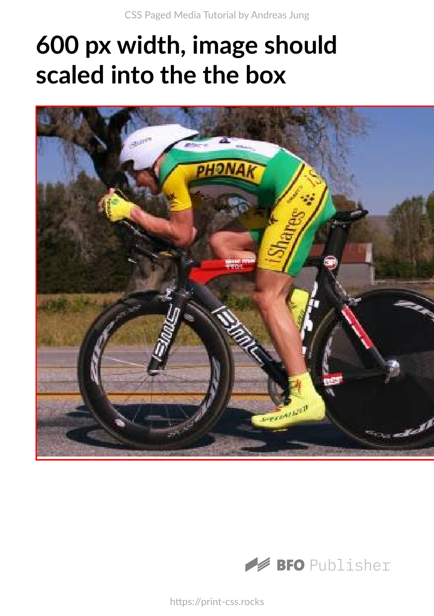
This example show how images will be scaled into the boxes with a a given width. Setting width: 100% on the image should auto-scale the image into the parent box. The first two example will place the image in its original size into the parent container. No scaling should happen. The image on the first page should be clipped at the right border due to the overflow: hidden setting on the parent container.
Repository files
PDF files
| Converter | Status | PDF Preview |
|---|---|---|
| PDFreactor |

|


|
| PrinceXML |
|


|
| Antennahouse |
|


|
| Weasyprint |
|

|
| PagedJS |
|


|
| Typeset.sh |
|


|
| Vivliostyle |
|


|
| BFO |
|
|
OK
.svg) OK with issues
OK with issues
 Error
Error
 Unsupported
HTML input
<html>
    <head>
        <link rel="stylesheet" type="text/css" href="styles.css" />
    </head>
    <body>

        <h1> 300 px width, image should be clipped</h1>
        <div class="w-300 outer">
            <div class="no-fit">
                <img class="no-fit" src="600x300.jpg"/>
            </div>
        </div>

        <h1> 600 px width, image should fill the box</h1>
        <div class="w-600 outer">
            <div class="no-fit">
                <img class="no-fit" src="600x300.jpg"/>
            </div>
        </div>

        <h1> 300 px width, image should scaled into the the box</h1>
        <div class="w-300 outer">
            <img class="fit-size" src="600x300.jpg"/>
        </div>

        <h1> 600 px width, image should scaled into the the box</h1>
        <div class="w-600 outer">
            <img class="fit-size" src="600x300.jpg"/>
        </div>

    </body>
</html>
Stylesheet
@import url("../styles/a5.css");

div.outer {
    break-after: page;
}

div.no-fit {
    overflow: hidden;
}

img.fit-size {
    width: 100%;
}

.w-300 {
    width: 300px;
    border: 2px solid red;
    margin-bottom: 1em;
}

.w-600 {
    width: 600px;
    border: 2px solid red;
    margin-bottom: 1em;
}

.w-1000 {
    width: 1000px;
    border: 2px solid red;
    margin-bottom: 1em;
}