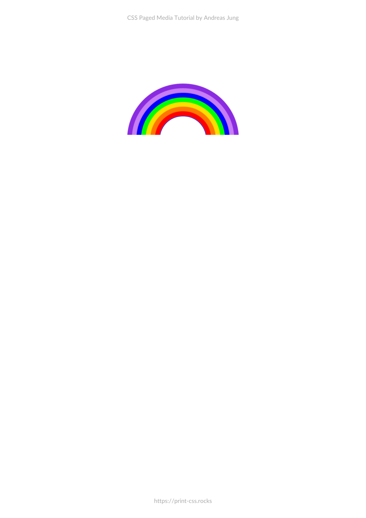
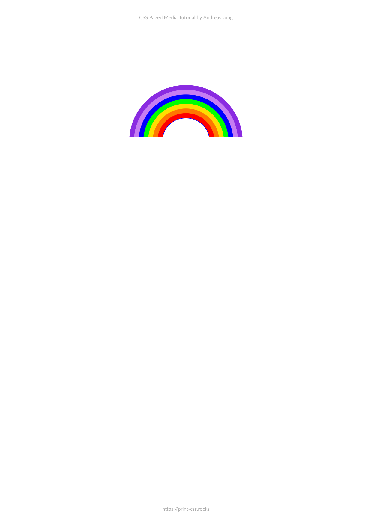
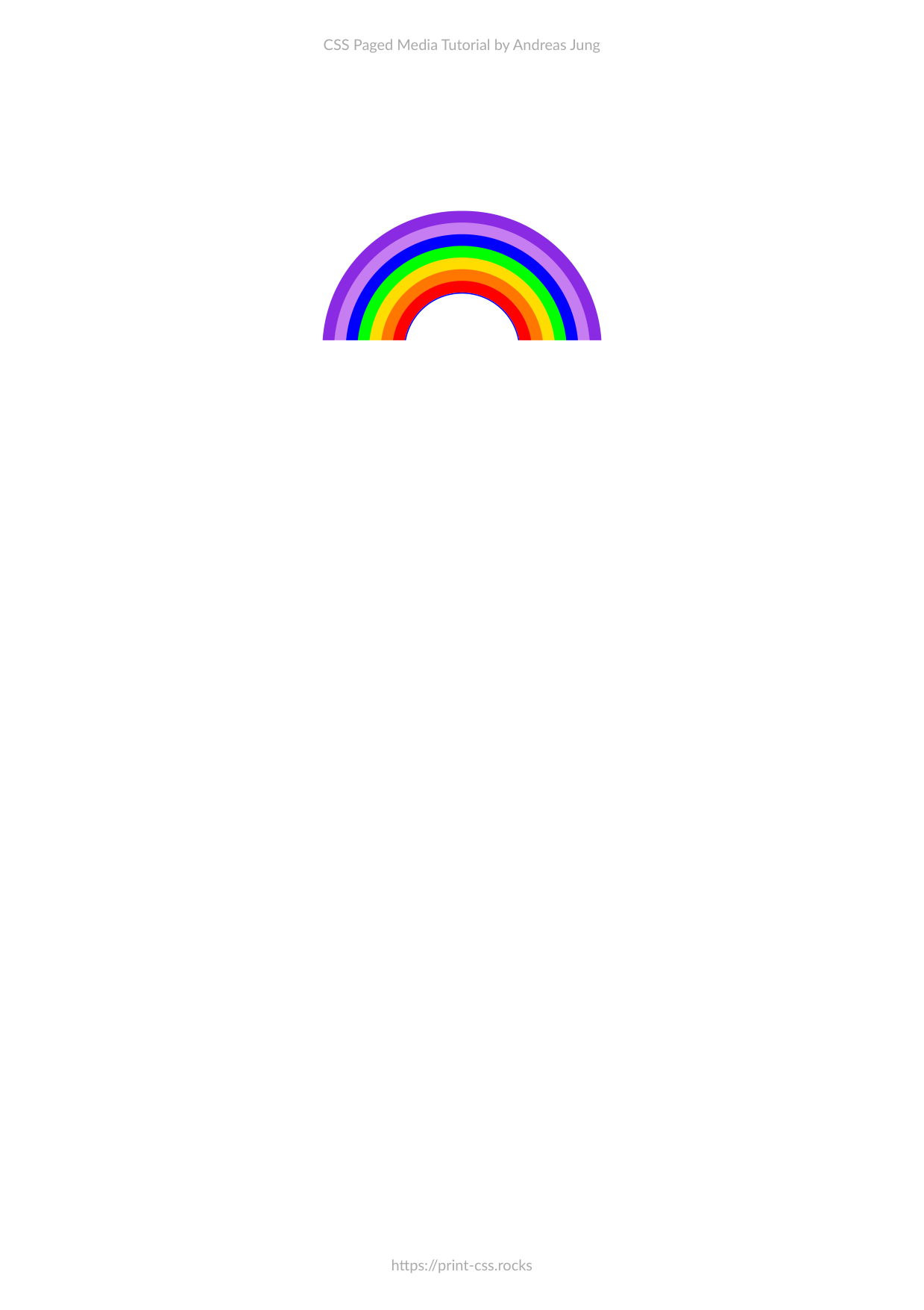
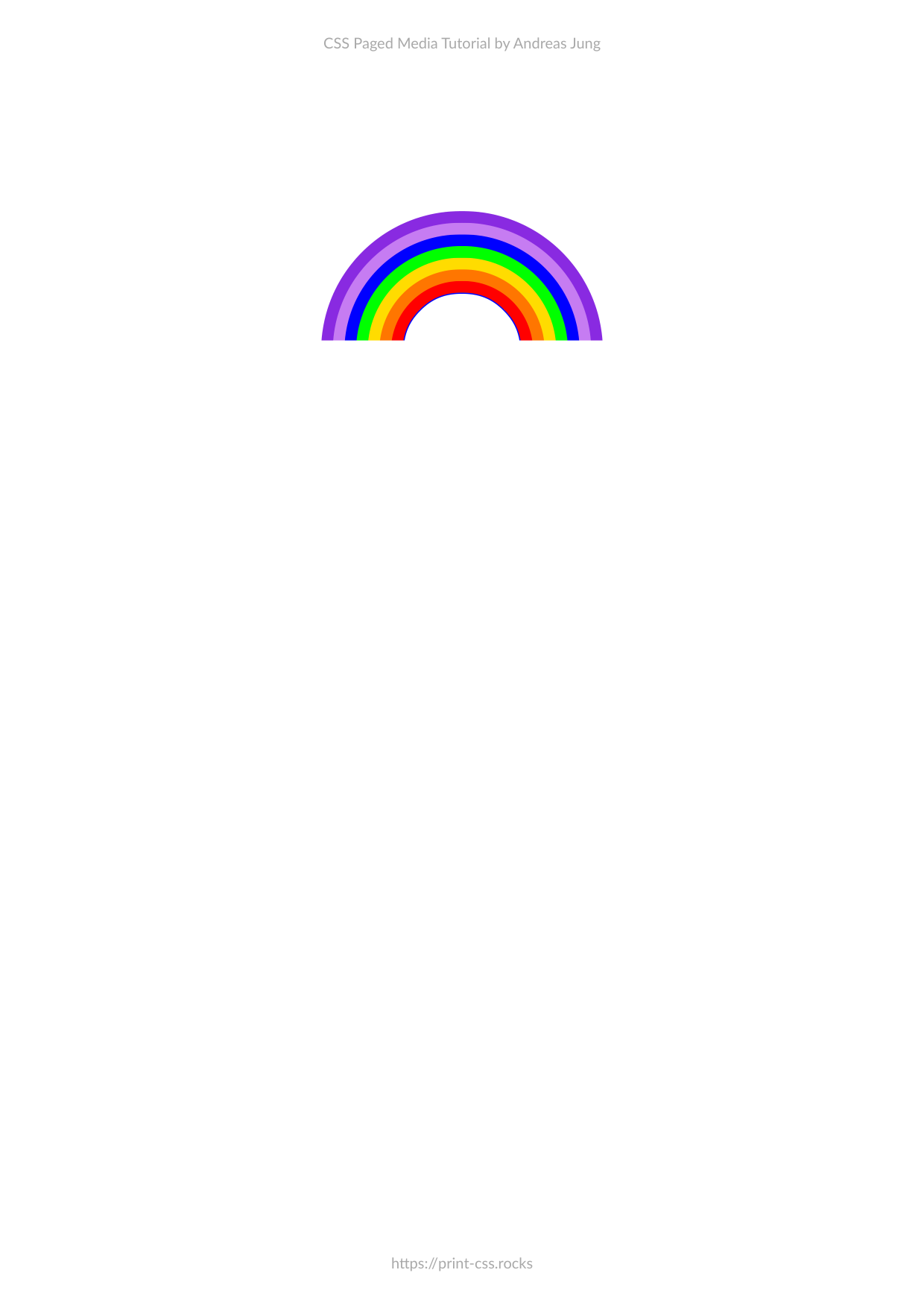
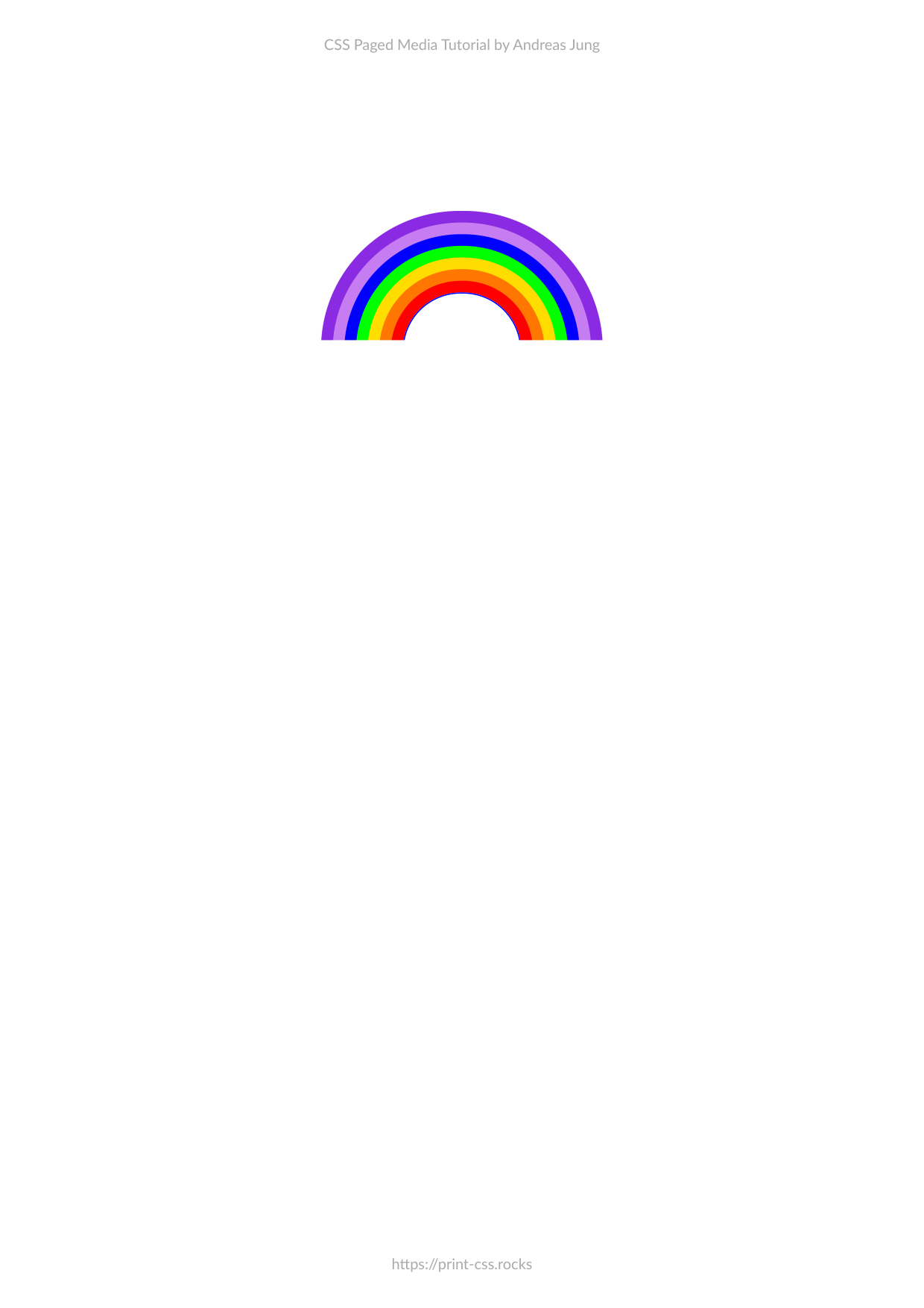
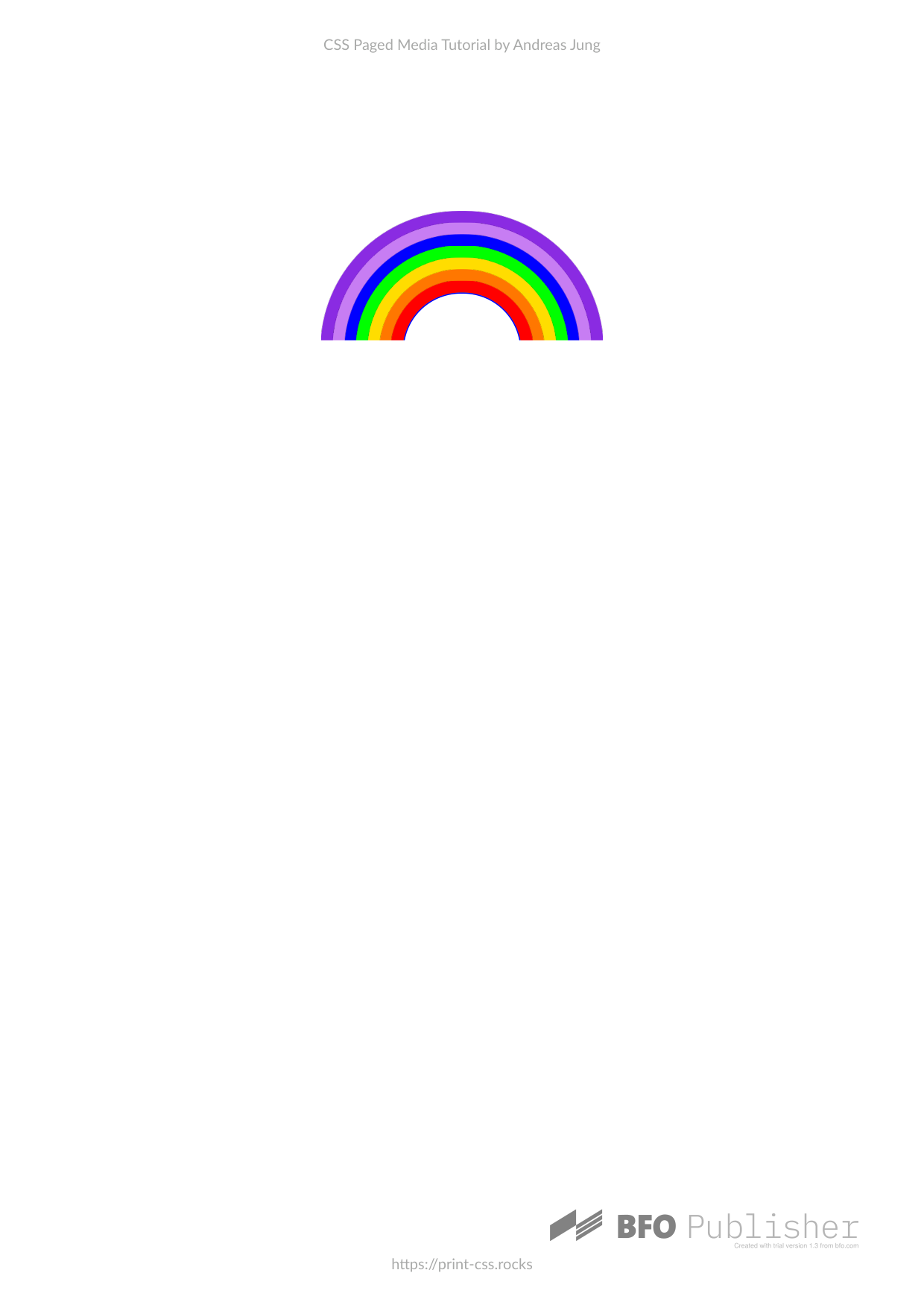
Rainbow using box-shadow
This example shows how to generate a rainbow using CSS using the box-shadow property.
Repository files
PDF files
| Converter | Status | PDF Preview |
|---|---|---|
| PDFreactor |

|
|
| PrinceXML |

|
|
| Antennahouse |
|
|
| Weasyprint |
|

|
| PagedJS |
|
|
| Typeset.sh |
|
|
| Vivliostyle |
|
|
| BFO |
|
|
OK
.svg) OK with issues
Error
OK with issues
Error
 Unsupported
HTML input
<!DOCTYPE html>
<head>
    <title>My Example</title>
    <link rel="stylesheet" type="text/css" href="../styles/a4.css">
    <link rel="stylesheet" type="text/css" href="styles.css">
    </head>
    <body>
        <div class="rainbow"></div>
    </body>
</html>
Stylesheet
.rainbow {
  top: 20mm;
  margin: 0 auto;
  margin-top: 150px;
  width: 200px;
  height: 100px;
  box-shadow: 0 0 0 10px #ff0000, 0 0 0 20px #ff7700, 0 0 0 30px #ffdd00,
    0 0 0 40px #00ff00, 0 0 0 50px #0000ff, 0 0 0 60px #c77df3,
    0 0 0 70px #8a2be2;
  border-radius: 50px;
  transform: rotate(-90deg);
  position: relative;
  border: 1px solid blue;
}

div.rainbow:before {
  content: "";
  width: 150%;
  height: 300%;
  background-color: white;
  position: absolute;
  left: -70%;
  top: -100%;
}